An editorial pedant: one or two spaces after a full stop?

I took a seminar yesterday with my current crop of dissertation students working hard to submit their undergraduate dissertations next week.  You can imagine the eye-roll when in response to a formatting query I had a minor rant about the number of spaces after a full stop, or if we are being American after a period.  This devolved into banter between myself, an ardent two spaces type of guy, and one of my doctoral students present to assist with the seminar who is very much a one space girl.

I learnt to touch type back in the 1980’s on an upright typewriter the summer before leaving for university.  This was one of the best things my parents ever encouraged me to do.  Ever since those days I have stuck rigidly to the two space rule, despite quickly transitioning to a word processor.  The argument goes that modern fonts are designed with variable widths to aid reading and to make the two spaces redundant.  But like an editorial pedant I have stuck, to them although I have stopped correcting the error (at least in my opinion) in other people’s work.

So this morning while displacing from a real task (or conducting an exercise in strategic procrastination if you prefer) I had a quick Google and was pleased find this piece in The Independent from earlier in the year that suggested that scientists had answered this age old debate using eye tracking software.  The original research published in Attention, Perception, & Psychophysics showed some marginal improvement in reading speeds with the use of two spaces.  The gain was small and the results have been disputed, but it is good enough for this dinosaur to continue to claim that the world is better with two spaces!

show symbol

If you are a student, there is this little tool on Microsoft Word which shows the hidden formatting which I have turned on all the time so I can see the number of spaces and the hard paragraph returns.  It can be useful and this sort of pedantry should not concern you overly, just pick a side and be consistent.

Working with Audacity: Create that podcast today!

Creating a podcast or sound clip for that important presentation is easy using something called Audacity or so I learnt last week.  Previously I had always struggled to edit audio in video editing software such as Camtasia but never again.  Audacity is a powerful tool and is freeware to boot!  Just watch the download, it seems simple, but you need an extra file to make it work with MP3 files.

audacity logo

I discovered Audacity while creating an audio-book for my daughter.  Stories written and recorded by my mother, with music and sound effects added by me.  Audacity records well both using a microphone and internally while sampling YouTube sound effect files.  There are some good noise reduction tools as well and some other simple effects of which i have only just began to scratch the surface.  It is simple and intuitive to use.  There is also a healthy body of ‘how to’ videos on YouTube and a variety of websites all offering support and help.

So yes this must read like a sales pitch for Audacity and so it is; it is awesome for the occasional user like myself and has opened my mind to the idea of the podcast as part of my teaching portfolio.  I have previously done a few podcasts to sit alongside PowerPoint slides, but the idea of the podcast covering key topics is centre stage in my mind at the moment, so what this space!

Practice makes perfect in academic writing?

The relative importance of practice versus innate talent is a matter of extensive debate and there is some pretty cool research out there and lots of popular articles to read.  Malcolm Gladwell coined the term the ‘ten thousand hour rule’ in his book the Outliers and developed this further in a piece in the New Yorker.  Basically complex tasks like composing or playing chess at the highest levels require in excess of 10,000 hours of practice so the rule goes.  The question here off course is where does raw talent (genetics) feature?

This debate is explored in relation to new research by Maria Konnikova in another piece in the New Yorker.  On reading her piece I was struck by a number of things.  Firstly, that the average athlete benefits most from practice and training while the margins of gained are much smaller for elite ones. Secondly practice relative to raw talent operates differently in different areas having less impact on education and computer science for example when compared with music or sport.  Finally, if you take a group of highly talented individuals their career performance is ultimately determined amongst many factors by ‘work (practice) ethic’.  Now I believe in the importance of work ethic; the more you invest in yourself and your contribution the better the outcome.  Constructive and directed industry has always been a big indicator of success in my opinion, although it is often mitigated by the power of an extrovert who can tell a good story.  There is off course the irrational pique here of an introvert speaking.

So why am I writing about practice?  Well I run sessions for the Doctoral College here at Bournemouth on academic writing.  As a severely dyslexic individual writing has always been difficult, but over the years I have done a lot of it, and while I would never say that I am particularly good at it, I am continually learning and improving.  I advocate in these sessions the importance of practice, off investing in one’s own development.

Now writing is a skill that is on the decline in most science graduates.  Can I evidence this?  Well not really, but it is apparent every semester in the papers I grade.  The point is that students don’t get the chance to practice in the mercenary academic world in which we live.  In this world only the thing that seems to count to most student’s is work that contributes to a final grade.  Summative assessment is king and we are increasingly limited as tutors by what we can set.  As tutors we do not help this because with the growth in class sizes we usually strive to reduce grading at all costs.  Yet what science students really need is formative assessment and coaching in writing.  As a student I had to write four tutorial essays a semester in addition to coursework, these essays didn’t count for any unit grades but they did in hindsight help me along the way.  Over thirty years later you would not get a modern student doing this unless there was a grade it in.  As I say education has become very mercenary.  So when a student graduates and ends up needing to write academic papers in Graduate School they struggle.  It is why they come to classes on academic writing!

My answer is the same however; you need to practice.  Write something every day, it doesn’t really matter what as along as it is coherent prose.  I advocate the use of blogs, after all they don’t have to be public and there are so many of them these days that most remain obscure even if they available online.  A blog post of 500 to 600 words is an ideal length to practice, and writing prose free of references and academic baggage allows you to focus on the writing itself.  In class I am asked: write about what?  My answer is always, anything that holds your interest.  Who will give us feedback?  No one is the answer, learning to be your own critic is one of the keys to good writing.  How many take this advice?  To be honest I am not sure, but I hope they do, because in the case of writing reading good prose and emulating this through practice and self-critique will always be king in my view.

I have one other tip to pass on.  I once had a management coach when on the academic leadership track and he told me a story which I can’t now remember to whom it was attributed, but basically it went like this.  Instead of sitting down at your computer each morning and writing emails, posting on Facebook or Twitter write a piece of coherent prose for half an hour and you will have a more productive writing day.   Not sure what the evidence for this was or is, but try it because it works for me.

If you are an undergraduate reading this.  Well my message to you is simple, practice and invests in yourself and in a good work ethic and in my experience you will win the day.

The use of the word poo, or a matter of tone?

A brief note in the journal Nature caught my attention the other day.  It took issue with the use of the word ‘poo’ in a research highlight; in fact it called it juvenile.

The highlight was a news piece not a research article and was reporting on an article published in the Proceeding of the National Academy for Science entitled: Responses to pup vocalizations in subordinate naked mole-rats are induced by estradiol ingested through coprophagy of queen’s feces. 

So is this an example of poor use of tone in academic writing, or a simply pomposity on the part of the author of the comment?

Finding the right academic voice or tone is difficult for many students.  Over the years I have marked many assignments in which the author writes as if they are talking to their mates in the pub.  Equally I have read more than one Masters Dissertations (and PhD thesis and papers to boot!) in which the author seems to believe that route to scientific veracity is to write in the most convoluted and pompous prose possible.  In fact there is a bit of a pendulum at work here; students start out too informal and end up at the other extreme, before hopefully finding a mid-ground as they develop their practice.

I am an advocate of direct and active prose where ever possible and to me pomposity, convolution and pretension is like a spark to a gas ring.  The KISS acronym holds well in my view: Keep it Short and Simple.  Simple does not however mean informal.  As writers we should aim to communicate clearly using appropriate language for the audience and above all else make sure that we write in direct and clear prose which is also wherever possible engaging! Practice is the key. Find academic authors and science journalists we like to read and reflecting on and dissecting their style to adapt and form in to our own style through practice is the key.  I don’t hold myself up as a good writer, simply one doing his best and learning through practice.  I like to reflect occasionally on the six rules on good writing proposed by Orwell and modified slightly here:

  1. Never use a metaphor or other figure of speech which has become hackneyed.
  2. Never use a long word where a short one will do.
  3. If it is possible to cut a word out, always cut it out.
  4. Never use the passive where you can use the active.
  5. Never use a scientific word or a jargon word if you can think of an everyday English equivalent. Write for your audience and never forget that it is they that count.
  6. Break any of these rules sooner than say anything barbarous.

Would Orwell have used the word ‘poo’, perhaps?  Do I agree with the comment about the use of the word poo, no!  It is a headline, designed to draw the reader in which in my view is acceptable.  The term ‘feces’ is the correct term for the title of the paper sure, but a journalist even in Nature should be able to have some latitude with a headline.  We drink our own pomposity, at our peril and the more pompous we become the more distance we place between ourselves and the general public.

Writing a Literature Review

Call me old and cranky if you like, but I have read a lot of bad literature reviews in my time.  I know I am in for a challenging read when the chapter or section is actually entitled ‘literature review’!  I was asked to provide guidance to a group of student recently, so after a quick Google which yielded loads of information but also a lot of conflicting advice I decided to reach for my keyboard.

A literature review is a description, explanation and above all else a synthesis of existing literature on a topic.  I place emphasis on the synthesis part; this is where the marks are to be found if you are a student.  So what does synthesis actually mean?  Well a synthesis is a combination of components that form a connected whole.  A pile of bricks is not a synthesis, but a house is.  Equally a chronological description of the literature is nothing more than an annotated reference list.  By contrast a useful literature review is a document which: synthesises common themes; synthesises literature either side of a debate; or scopes the unresolved issues or research gaps.

It is generally agreed that there are two type of context in which you would need to review the literature.  You may be set an assignment in which you are asked to review the literature on a subject.  Essentially this is an essay (usually with sub-headings) which demonstrates that you have found, read and understood the scientific writings on a subject.  The emphasis here is on peer-reviewed journal articles and edited chapters, not web-sources or text books, although this can vary between disciplines.  In a student context is just another assignment to be conducted within the rules set out in the assignment brief or to be clarified by your tutor.  In a professional context there are scientific review papers which aim to promote a discipline and define future research agenda within it, or simply to bring together a dispersed and obscure literature.  There is an important sub-set here which is the systematic review.  This is common in medical disciplines.  For example there may have been several different medical trials of a particular treatment over a number of years.  A systematic review finds all this data, reviews its quality, provides analysis of this data and draws out a conclusion about future practice from that data. They are designed to provide a complete, exhaustive summary of current evidence relevant to a research question.  The emphasis is on using and synthesising published data on a subject.  We are going to set them aside here because they have their own rules and methodologies.

Apart from a student assignment or a dedicated review paper the other context in which one must review the literature is at the start of a dissertation, thesis or academic paper.  This is a key part of the introduction and does not need to be sign-posted with the words ‘literature review’.  In my view it is crass to do so.  In a PhD thesis where the scope is much greater it might form a standalone ‘state of the art’ chapter, but in almost every other context it is simply part of the introduction.  The aim here is to demonstrate:

  • The rationale and context for your research question demonstrating that others think it is important and timely to study as well.  The work of offers is used to support your claim that it is interesting, important or timely.
  • That you are not simply replicating published work but contributing to a knowledge gap or refining a question that you understand. That by contributing new data, or taking a different approach, to an unresolved issue you are advancing knowledge or practice.
  • That you know what you are talking about! That you are using common methods, definitions, terms and approaches.  That your reader identifies with these terms and understands any variance you have adopted from the established norms.

So let’s look at a literature review in the context of it being simply an extended introduction.  There are two key statements or paragraphs.  The one you start with and the one you end with!  You need to start with a broad focus or ‘hook’ that attracts your reader.  It is not quite a newspaper headline like the Sun’s distasteful ‘Gotcha!’ headline of 1982, but its aims are similar to draw the reader in and make an initial point.  Why is the study important?  Why is this paper or dissertation worth reading?  What will the output be and how will it advance knowledge or practice in the area of study, or at least hopes to?

The final paragraph should loop back to the ‘hook’ and define the question, scope or aims/objectives.

“In light of the work by Tilman (2015) and Bird (2018) who collectively re-define this question and showed how it could be re-evaluated by contributing new data, it is timely to ask . . . . .  As a consequence this study aims to contribute new data to this debate by . . . . . . This aim will be realised through four objectives which are: . . . . . . .”

So we open the introduction with something broad that draws the reader in and then narrows the focus down to the research question in hand.  Now between these two points – the start and the finish – we need to place the work in context.  We need to define key terms, provide relevant background as appropriate, scope previous work in the field to help reader understand context of your approach and how your work will contribute.   This is the literature review.  The overall form of the text should be triangular; you start broad and progressively sharpen and focus the argument (or point) until you hit the reader with your aim.  And that aim should be sharp and make the reader sit up and say: “yes that makes sense, yes that will add something, wow that is well argued and justified.”  Reviewing the literature is a means to an end, not an end in itself.

So how do I go about it?

Let’s break it down into a series of steps:

Step One: Find your literature, download and/or print the papers.  Any academic search engine will do, my preference is Google Scholar.  Work hard to build up the literature you can find and use the reference lists in the papers you do find to ‘snowball’ other literature.

Step Two: Read critically.  By this I mean read in an engaged fashion, not just being critical of what you read.  Interrogate the article for information relevant to your question and focus only on what is relevant to your question.  Use what you read to guide and prioritise your reading.  For example if one paper keeps being cited then it is clearly important; find it and read it.  Writing one page summaries of papers can really help here (Fig. 1).

journal9

Figure 1: The one page summary of papers can really help.  You can keep them in an online note book or hard copy doesn’t matter but the idea is that you shuffle them in any order or set them out to find patterns.

Step Three: Looking for patterns.  How do the papers you read link together?  Can you group some of them as saying the same sort of thing?  What are the big themes?  There are lots of ways of doing this, but think of detectives working a case in a TV crime drama.  They usually have a wall or a board full of images, maps and items, may be with ribbons or lines drawn between key elements.  They are visualising their data looking for connections and patterns.  You can do the same.  Use a white board to jot down some key themes and list the papers under each.  Or use the floor or a large table and create piles.  Basically any way of trying to see your literature not in date order (or in the order you read it) but in terms of a new pattern.  This pattern provides the structure for review and the individual paragraphs within it.  You may find some gaps in your reading at this stage and need to go back to the earlier steps.  In facts steps One to Three often occur in parallel.

Step Four: Drafting.  Set the papers aside and turn to your keyboard.  Start by jotting down they key themes and then elaborate these into sentences and paragraphs.  Cite references from memory where you can, but don’t write from the papers themselves.  Write freely.  It is all too easy to slip into copying sentences or paragraphs consciously or unconsciously – don’t!  The reader wants to see your perspective on the literature not someone else’s.  Remember the triangle as you write – start broad and end up with a sharply phrased point at the end.  With your draft finished review it carefully looking for gaps and inconsistencies and remember that any given paper may appear several times under different themes.

Step Five: Refine and polish.  This is all about the fine detail.  Are you citing the right papers in the right places?  Have you spelt the author’s names correctly?  Are the dates correct and in the right order?  Do all the text citations correspond to a full reference in the reference list and vice versa?  Do the sentences make sense?  Does your argument or succession of paragraphs build one upon another and sharpen the focus broad to point?  Does you aim follow clearly from the succession of paragraphs?  Success is all in the detail once you have found the big themes and pulled them out.

Frequently asked questions

So what is enough?  Well if it’s an assignment then look to the brief or your tutor for clarification.  Typically they may use words like ‘review the main or key sources’ or ‘review the significant literature and developments.’  They are clearly asking you to be selective in what you include.  Alternatively if words like ‘comprehensive’ appear you have your answer.  For a dissertation you need to be pretty comprehensive is my personal view, but remember you are not describing each paper but finding the themes and citing the relevant literature to that theme.

Can I cite material cited in other papers?  The simple answer is no.  Only cite and discuss what you have read yourself.  How do you know that another person has read and interpreted it correctly?  So if I can’t get a key source?  You should try to get it or leave it out; it’s that simple.

Can I cite web sites and textbooks?  It depends a bit on the subject and level but basically not often.  There may be a defining manual or textbook for a subject especially in an area of practice and off course this may feature heavily in your review, but where ever possible go back to the primary sources.

Should I cite old papers?  Yes just because its old does not mean it is not key to a debate or seminal in the development of a subject area.  It is often harder to get older material however, many of the big publishing houses have back catalogues that stop in the mid-1990’s this does not mean it not worth pursuing.  Material that is not accessible electronically is not by default rubbish.  If a debate has lots of recent discussion then your focus will be there, but that is not always the case.

If a whole paragraph is based on one source where does the reference go?  Again there is no perfect answer but generally not at the end.  Start by saying something like:  “The work of Smith (1988) is key here.  They studied the question closely by conducting the following experiments . . . .  The key conclusion in Smith (1988) is that . . . . . The work of Smith (1988) was developed by Thompson et al. (2005) who modelled the system using . . . .”   Basically make sure the reader knows that it is Smith’s work that you are talking about by reminding them regularly.  If you only have a few sources, either because that’s all that was written or because you have not found more, then the same names will be used a lot and it is what it is.

When I have multiple citations against a sentence what order should they go in?  Date order and if they were published in the same year alphabetically, so:  “The idea that the literature view was key to the development of academia has been widely discussed (e.g., Bogs, 1967; Simons, 1988, 1989; Briggs et al., 2002; Smyth, 2002).”
Non-Linear narratives Or Why PowerPoint is bad!

Help this research by taking this anonymous quiz.

Non-linear narratives are fun, because the audience and presenter don’t know where you will end up, or if they do they don’t know by what route (Fig.1).  I used to read to my children stories that required them to make a choice of story direction and we would weave our way through a book flipping between pages as directed.  A good story tellers sitting around a camp fire never tells a story the same way twice and are always a pleasure to listen to even if you know the stories punchline.  Long live the art of storytelling.  Just because we are scientists doesn’t mean we don’t tell stories; off course we do ‘evidence-based’ stories mind, but they are still stories.

networks

Figure 1: A good storyteller can end up in the same place but will get there in a different way each time.

Microsoft PowerPoint and similar presentation tools forces linearity and once you post a set of slides students or your listeners expect you to follow that structure and to cover all the material.  PowerPoint sets a way of thinking which is not always very helpful.  In my experience it hinders lateral thinking and positive digression.  I am not the first person to think this and there is a body of work critical of PowerPoint and also defending it.

My first serious foray into ‘non-linearity’ came in 2017 when the research team, of which I am part, was awarded the chance to present at the Royal Society Summer Exhibition.  This is the premier research engagement session in the UK, with a footfall of over 11,000 ranging from dignitaries attending black tie evening sessions, to the general public and to school groups during the day.  We designed an educational experience around our theme ‘Dinosaurs to Forensics’.  I had last exhibited in 2005.  On that stand we had a large plasma screen with a linear PowerPoint running on a loop.  It was limiting when talking to a visitor, since you would often have to wait for the right slide to appear to prompt a conversation.  In 2017 we needed a teaching innovation that was non-linear.  The solution we came up with was a series of large icons on the display board each with a bar-code.  The presenter had a wireless bar-code reader with which they could zap an icon and an appropriate item or video clip would appear on the plasma screen.  In this way the presenters were able to use the icons to support different conversations or educational messages tailored to the needs of different visitors.  It was huge success.

Now I have an interest in the visual presentation of data and I was hooked on the idea of creating an alternative to PowerPoint that was non-linear, essentially bringing the Royal Society exhibit learning into the classroom.  The concept I had was like an image board similar to something you might see on Pin Interest.  That would be the hub of your lecture.  Behind each picture would be a link to YouTube, to a block of slides or to some other resource.  Essentially it would be like a window into a bank of slides or resources that you could call upon in any order; in a non-linear order.  You would not necessarily use all the slides just those that you needed on that day.  I talked at length to my collaborator in Computer Science (Professor Marcin Budka): could we create a rival to PowerPoint?  Well one day with funding we might just do that – freeware for the non-linear narratives.  However we quickly released that we could create a PowerPoint template that would actually work in a non-linear fashion.  Essentially the home slide is a grid of boxes (a bit like the grid of icon boxes you get in Windows 10), different sizes, shapes and colours.  By clicking on a box you get a slide or slides that relate to that box including any embedded media.  There is a large back arrow on the slide(s) that takes you back to the home screen.  Basically there is no forced linear narrative.

Feeling brave and keen to co-create some educational research with my students I am trying this out on my Physical Geography students in the autumn of 2018.  Wish me and them luck!

I am interested in your thoughts on presentation software and if you would like to contribute anonymously then you can do by taking the following quiz.

Time management and the eye of the storm

Now this is definitely one of those things in which the phrase ‘do as I suggest, not as I do’ applies!  We are talking about time management.  My problem is that I have too much on at any one time, rarely say no to requests to do more and get sucked in to the current project to the exclusion of the others.

There are countless websites YouTube videos with advice and self-help suggestions.  They distil in various ways to working out what the tasks are both urgent and give the greatest reward.  You are meant to prioritise them and there are various matrices to help you do this which all stem from Eisenhower Power Box.

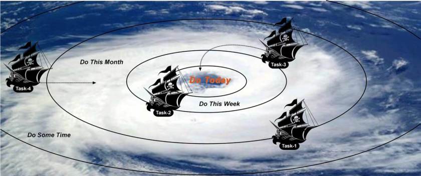
Use it if it helps.  The other method of prioritising and tracking tasks is something being a geographer I call the ‘eye of the storm’ (Fig. 1).  A colleague told me about this a while ago but called it ‘the pit’.  It is a series of concentric rings which you put on a big piece of paper.  At the centre is the stuff you should do now and is urgent, the stuff on the outside is less urgent.  When you get a task put it on a ‘post-it note’ and place it on your poster depending on its urgency.  Every few days review the live tasks and move them accordingly as they change priority.  It is the trajectory that matters tasks that are for ever circling the pit, or in my case the eye of the storm, are less important than ones that are careering with speed towards the centre.  You work calmly in the centre of the pit and keep an eye on the surrounding walls for falling rocks especially those propelled towards the centre by others!  The concept also holds for a hurricane.  Think of the eye in the centre as the calm spot where you work keeping a weather eye on the flying debris heading towards you.

eye

Figure 1:  Closer to the eye the more urgent a task is.  The key is to watch the trajectory of your tasks.  The idea stresses that your work load planning is dynamic and you should review on a daily, weekly basis and move the ships!  To use practically draw some concentric circles on a piece of paper and use post-its instead of ships!

The final bit of advice I have is to think backwards.  We tend when faced with a task to always look forward to the deadline and when it seems far off we are comforted and when it looms panic.  The alternative is to always think backwards from the deadline.  So you have an assignment due in on Monday the 26 November 2018 [and if you are a 2018 Physical Geography student you really do!].  So that is the deadline.  Thinking back from this you can work out a plan:

  • You are going to need if you can to keep clear the weekend before in case there is a last minute panic.
  • The week before the deadline you will need to write and polish the assignment. This might be the week to bring a draft to one of the drop-in sessions, although lots of people may be doing this!
  • In order to do this you will need to have worked out what to say during the week before that to give you a chance to organise the material you need and do the necessary reading.
  • The week before that you need to perhaps attend one of the drop-in help sessions to check your understanding of the task, seek guidance and test our your initial ideas.
  • How does this three week timeline fit with your other tasks and assignments? Perhaps you will need to build in an extra week or a pause while something else takes centre stage?

The idea is that by working backwards you visualise the end point and can plan more effectively.  In a crude way it’s a bit like an Olympic athlete visualising victory and working back from there.  Working forward you often end up with a greater sense of impending doom!  As the Fraser of Dad’s Army fame would say ‘we all doomed! Doomed I say!’  Better to think of the pleasure of a calm and controlled submission and work back from there and you will never be doomed!

Procrastination!

Does the early bird really catch the worm?  Well so I always thought until last year when I was preparing a lecture on time management having just read a fantastic book by Adam Grant called the Originals (2016); brilliant it is and I firmly recommend it to anyone.

In Originals Grant argues that procrastination has its place.  He makes a similar case in a New York Times article.  He cites the unpublished work of one of his students.  Students were asked to produce business plans for a new shop on campus.  Some were asked to start ASAP others after procrastinating by playing video games.   The procrastinators scored as more creative in idea generation.  His explanation was that while procrastinating they were thinking about the project subconsciously and therefore had more considered solutions.

It is not the type of answer that someone trying to encourage students to plan better and start their coursework early wants to read and it has been widely challenged in several blog posts.  Here is another.  What Grant was really talking about is perhaps better described as ‘strategic delay’ and taking time to consider and review all the options before leaping in to action. It may allow you time to gather your ideas, to reflect on the challenge, wait for more information, learn from your peers mistakes’ as they start the task.  The downside is you have less time to complete the actual task and the closer to the deadline the more pressure you may feel and the greater the impact that pressure may have on other deadlines.  So, the truth is probably something like this: planning is good and including an element of ‘reflective delay’ is potentially beneficial as long as something actually happens during the delay (i.e., you are thinking about the task).

Why not have a read of some of the post on this subject and see what you think?

Summaries of summaries: abstracts and the like

OK so this is one of those things that sounds dull but is really important professionally and also a useful tool when linked to critical reading.  Stick with it since there is a lovely bit of research to discover at the end.

So a summary is: ‘a brief statement or account of the main points of something and does not include needless details or formalities and is above all else brief!  In academic/professional circles it has many names, including: synopsis, précis, résumé, abstract, abridgement, digest, compendium, condensation, encapsulation, abbreviated version and/or case/evidence summary.

Here I am going to focus on the précis, executive summary, abstract, and lay summary.  I would also draw your attention to the use of the rhetorical triangle which is always worth remembering.

Précis

A summary for another professional or yourself and I would argue that it is a key part of critical reading.  So what are the goals?

  • Compress and clarify a lengthy passage, article, or book, while retaining important concepts, key words, and important data.
  • It is not a personal interpretation of a work or an expression of your opinion but rather, an exact miniature replica of the work itself.
  • It is about removing the superfluous so that the core of the work stands proud.
  • It should give a brief description of key terms, describe actions or methods applied and report the key results. It should finally state the next actions/steps and/or the main conclusions.
  • When finished, the précis should clearly state: (1) who did the study; (2) what the context and rationale was; (3) what was studied, argued or discussed; (4) how was it done; (5) what was learned; and (6) what the implications of the work are and what now needs doing.

While it may seem obvious it is critical that you understand the material in question and have read it all.  It is not about extracting sentences or quotes, but involves reading the piece and then setting it aside to write the précis.  You need to see and understand the whole first. Aim to fit it on no more than one page of A4, less if you can, but emit nothing from the essential argument or most pertinent data.  Do not copy a single sentence from the article! Use key words and technical phrases where there is no alternative.  When you are done review your précis to confirm that you have explained the main point of the article, identified the supporting evidence that the writer uses, and have used the same logical structure as the text.  Finally, check for clarity, coherence, and correctness.  If there is one key graph/diagram you may wish to clip it via image capture and append it to the summary.

I have written before about the use of the rhetorical triangle and there is such a thing as the Rhetorical Précis Format.  It runs something like this:

  1. In a single coherent sentence give the following:
    • Name of the author, title of the work, date in parenthesis.
    • A rhetorically accurate verb (such as “assert,” “argue,” “deny,” “refute,” “prove,” disprove,” “explain,” etc.)
    • Athat clause containing the major claim (thesis statement) of the work.
  2. In a single coherent sentence give an explanation of how the author develops and supports the major claim (thesis statement).
  3. In a single coherent sentence give a statement of the author’s purpose, followed by an “in order” phrase.
  4. In a single coherent sentence give a description of the intended audience and/or the relationship the author establishes with the audience.

Executive Summary

This is a key feature of a professional report such as you might write in professional practice.  There is a huge amount of advice on line to help write the perfect summary for a business report.  While written about stuff far from geography you still may find some useful pointers in this, just Google tips for writing executive summaries.  Whatever others may say the executive summary is not the same as an abstract.  They are different.

The basic point is that busy people want to get to the heart of the issues quickly.  They want to know whether they need to read the whole report, and know if it will it be relevant and interesting to them. People are basically lazy, so can they get the gist of the work without reading the report, or at least focus their reading on the key sections?  In writing a report you want to make sure that the key recommendations/actions are front and central and you do this via the summary.  It is not a précis, for one thing it can be longer and it expresses the main argument and conclusions of a work.  It usually has an opinion!

Here are some pointers:

  • Who is the intended audience of your executive summary?  Is it your boss, a group of colleagues, or the general public?  What content do they really need to know? When you are writing you should keep your intended audience in mind at all times and write it for them. If your audience includes your boss think: how much do they already know, and how much do you need to explain?  If your audience includes journalists, you probably need to explain everything.
  • First categorise the document by whether it needs action or is for information only. This will determine the language that you use.
  • Next, you need to identify what, when they have finished reading, are the key messages that you want your audience to have in their heads.
  • If you find yourself getting bogged down in the detail at this stage, it’s a good idea to talk to someone else about what to include.
  • The language you use needs to be formal and the normal convention is to use a three part structure: introduction, body and conclusion.
  • You need to grab you reader early so use some form of hook to draw them in is essential.
  • Finally it acceptable to use a few bullet points in this type of summary.  These should highlight three or four key points or take away messages at the end.

Academic Abstracts

Abstracts are a whole new type of summary and an academic requirement for published papers, conference presentation, dissertation and thesis.  They have various aims but essentially they are about two things.  Firstly, they aid selection by the reader or conference attendee and secondly they assist with indexing via indexing and search services.

A good abstract should always be original work, and not simply an excerpted passage from the paper.  It should also be self-contained making sense by itself, normally without references or to the actual paper. It is also in most cases word/character limited and for some journals you are required to follow a given structure.  A good abstract is hard to write and needs practice.  As with lots of similar tasks there is a lot of guidance online some of it good a lot of it bad.  So what would be essential content?

  • Reason for writing: What is the importance of the research? Why would a reader be interested in in it?
  • Problem: What problem does the work attempt to solve? What is the scope of the project? What is the main argument, thesis or claim?
  • Methodology: A brief summary of methods and approaches is normal and the types of evidence collected, or experiments complete is normally considered essential.
  • Results: It should include specific data that indicates the results of the project. Other abstracts may discuss the findings in a more general way.
  • Implications: How does this work add to the body of knowledge on the topic? Are there any practical or theoretical applications from your findings or implications for future research?

The key thing is to distinguish between ‘describing what is in the paper’ and ‘reporting what is in the paper’.  The latter is what you are aiming for.  Here are a few examples of what not to do and what to aim for:

Poor: “We will scope the research in the field.”

Better: “Research in this field falls into three areas they are: . . . .”

Poor: “We follow the methods of Robinson (1968).”

Better: “We use a total capture method in which all insects in the study area were collected. “

Poor: “We describe the results and conclusions are drawn.”

Better: “What are the results and what are the implications?”

Poor: “We describe five geological sections in detail.”

Better: “Five geological sections are examined they reveal a range of lithofacies including those associated with lacustrine, coastal and aeolian depostional settings.”

Poor: “The implications of our findings are discussed.”

Better: “The implications of our results for the nuclear industry are clear; nuclear power plants are at risk in coastal settings around the North Atlantic Margin.”

Finally as with all writing we are encouraged to be concise, precise and to say things once and only once.  Brevity is everything, who want to read a load of waffle?  You will find that almost all the advice online focuses on brevity, but is this actually what is needed?

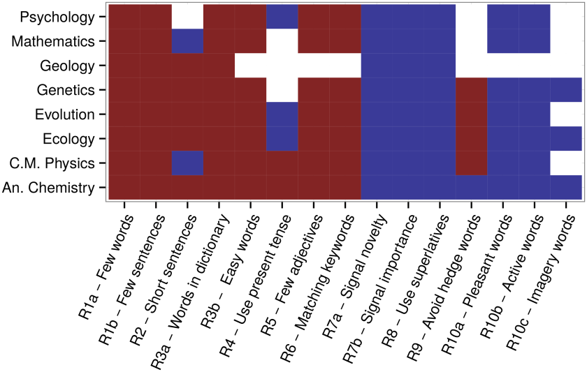
I came across this wonderful bit of research recently by Weinberger et al. (2015) around the ten simple rules for science writing.  They collected over a1 million abstracts from eight disciplines, (Ecology, Evolution, Genetics, Analytic Chemistry, Condensed Matter Physics, Geology, Mathematics, and Psychology) over 17 years and subject them to analysis.  They identified ten writing rules based on published ‘advice’ and normalised them against citations.  Figure 1 is their summary chart with rules shown vertical and disciplines horizontal.  If the cell in the table is blue it shows a significant rise in citations associated with each rule and if it’s red a decrease in citations.journal.pcbi.1004205.g001

Figure 1: The conclusions of Weinberger et al (2015)

The results are counter-intuitive!  So the advice says use fewer words and sentences (Rule R1a,b) and don’t use ‘superlatives or hype’ (Rule 8) yet both are associated with lower rates of citation.  The data actually implies that using wordy sentences with flowery language full of superlatives and writing long abstracts actually increases your change of being cited!  What is going on here?  The answer probably lies according to Weinberger et al. (2015) in the fact that academics like to read short concise abstracts but the longer they are the greater the chances of them being picked up by a search and surfaced for them to read in the first place.  Academics read what they can find easily and that is what Google Scholar and the like can surface quickly.  This dichotomy leaves the abstract writer with rather a challenge, and one that I don’t have an answer for!  Except this, if you’re a student keep it short, concise and to the point always!


How to make the most of freeware

So what is freeware?  Well put simply it is software that is free or at least purports to be free!

Free is good?  Right?  In many cases this is true, in some practice-based situations it is often preferable to use a large established and well known software system.

So for example; if you are preparing a photograph for court (or something very official) and need to label the image or adjust the brightness in a dark image then it is probably better to be on the stand saying that you did this in Photoshop than say the freewware Gimp.  Juries by and large know what Photoshop is but will have heard of it but Gimp?  For the geographers preparing material for a paper or report it doesn’t really matter.

There are different types of freeware; he is my attempt at a crude classification:

  • Community/user built versions of main stream software. For example, Gimp is a free version of Photoshop built by users.  The same is true of Inkscape and Illustrator.  The freeware is well established, does much of what the commercial software does and is actively supported by programmers and developers.  There is an element of fashion here, but the best free versions endure.
  • Community/user built specialist usually academic software. A group of academic come together to develop a piece of research software that gains momentum and widespread use.  The ‘R’ project is a great example (https://www.r-project.org).  It is a computing framework, interface and language that professionals can code in to do statistics and graphic representations.  Widely used and widely supported with lots of code libraries and tutorials.
  • Lone-operator(s) software. An individual or group of individuals who have created a piece of software for the fun of it or to overcome a particular analytical barrier.  These tend to be function/task specific and not widely supported by the community.  They can be very good and they can also be very bad!  Just think of the good and bad apps in the app store.
  • Professional software with free entry level versions. Software provided by commercial developers and companies that is offered free, with cut-down functionality or usage restrictions.  These products can be great if the bit you need is in the free part!  They are just frustrating if they aren’t.

There are two bits of freeware that could be used as substitutes for commercial packages that might really help , namely:

Adobe Photoshop >> GIMP

Adobe Illustrator >> Inkscape

Both these are broadly similar in their primary functions and are intuitively similar in many respects.

GNU Image Manipulation Program (GIMP) is a cross-platform image editor available for GNU/Linux, OS X, and Windows. It is free software and you can make changes to the source code and distribute your changes.

Inkscape is professional quality vector graphics software which runs on Windows, Mac OS X and GNU/Linux. It is used by design professionals and scientists worldwide, for creating a wide variety of graphics such as illustrations, icons, logos, diagrams, maps and web graphics. Inkscape uses the W3C open standard SVG (Scalable Vector Graphics) as its native format, and is free and open-source software.

Finally there is nothing wrong with using freeware, provided it does the job you need it to do and it does it accurately/precisely.  Sometimes however there are systems restriction within organisations which make downloading and installing such software difficult.  This does not apply to you own laptops however, just take care to only download stuff with known pedigree and from secure sites.

What follows is a list, in addition to GIMP and Inkscape that I personally think is useful to be aware off.  You may find other examples; please share what you find.  Bear in mind that my list reflects my professional interests and will be different from yours.

Useful freeware

  • As a geologist who does a lot of palaeontology and morphometric analysis I discovered PAST which is an outstanding statistical package with some neat graphic options. I use it exclusively in my own research.  It is supported by an online manual and a textbook published by Blackwell.
  • Mendeley is an excellent reference manager and is free; you can purchase additional storage however. It is excellent.
  • DigTrace is software that can be used to create 3D models from photographs. It is developed at BU and is extensively used in geological and forensic science.
  • Meshlab is an excellent 3D viewer for looking at point cloud data, basically 3D models. Rather specialised but extremely useful.
  • The ‘R’ project is a great example.  It is a computing framework, interface and language that professionals can code in to do statistics and graphic representations.
  • GeoRose is a software package for plotting directional information and is very good at what it does.
  • SedLog is a great tool for drawing stratigraphic logs.
  • GRASS GIS is a free GIS system which very popular with some academics.
  • Evernote is an excellent noting software tool; it is free at entry but requires purchases to unlock full usability.
  • Smartdraw has a range of graphic packages they are not all free and most involve payment at some point which is a bit disappointing.
  • The link that follows contains a generic list of stuff which may or may not be useful at some point in your professional career: https://gist.github.com/stared/9130888


 “There is a lot of cool freeware out there, just take a look when you need to do a specific task.”

“Use it discerningly!”

“Everyone has their favourite pieces of software; we are all different after all.  What works for one might not work for another.  ”